
页面布局是样式开发的第一步,也是 CSS 最重要的功能之一。常用的页面布局,其实就那么几个。下面我会介绍 10 个经典布局,只要掌握了它们,就能应对绝大多数常规页面。我会用到 CSS 的 Flex 语法和 Grid 语法,不过只用到一点点,不熟悉的朋友可以先看看教程链接,熟悉一下基本概念。
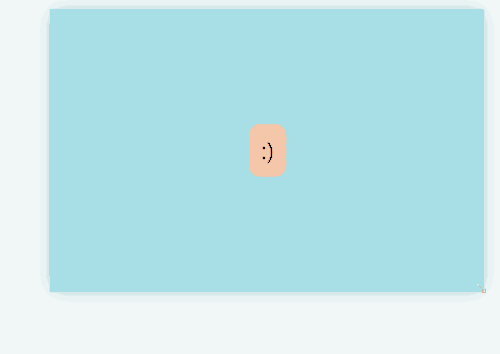
居中布局
在没有和 flex grid 之前,垂直居中一直不能很优雅的实现。而现在,可以结合我们 grid 和 place-items 优雅的实现同时水平居中和垂直居中。
- <div class="parent blue" > <div class="box coral" contenteditable> 🙂 </div>
- .ex1 .parent { display: grid; place-items: center; }
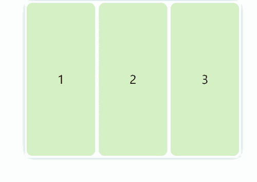
可解构的自适应布局
这种布局经常出现在电的网站:
在视口足够的时候,三个框固定宽度横放
在视口不够的时候(宽度在移动上面),宽度仍然固定,,但是自动解构(原谅我的中文水平),不在同一水平面上
- <div class="parent white"> <div class="box green">1</div> <div class="box green">2</div> <div class="box green">3</div> </div>
- .ex2 .parent { display: flex; flex-wrap: wrap; justify-content: center; }
- .ex2 .box { flex: 1 1 150px; /* flex-grow: 1 ,表示自动延展到最大宽度 */ flex: 0 1 150px; /* No stretching: */ margin: 5px; }
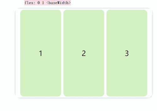
当我们设置 flex: 1 1 150px;时候:
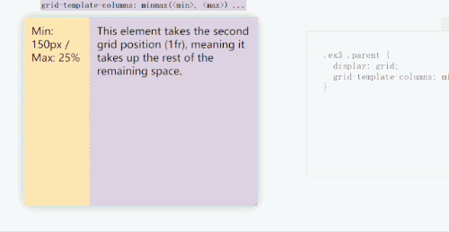
经典的侧边栏
同样使用 grid 布局,结合可以 minmax()实现弹性的的这在你要适应大屏幕的时候很有用)。minmax(, )就是字面意思。结合单位,非常优雅,避免了数学计算宽度等不灵活的手段(的我们设置间隙手段时候)。
- <div class="parent"> <div class="p yellow" contenteditable> Min: 150px / Max: 25% </div> <div class="p purple" contenteditable> This element takes the second grid position (1fr), meaning it takes up the rest of the remaining space. </div> </div>
- .ex3 .parent { display: grid; grid-template-columns: minmax(150px, 25%) 1fr; }
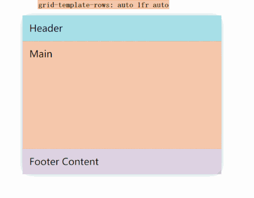
固定的页眉和页脚
固定高度的页眉和页脚,并保留剩余空间的主体是经常使用的布局,我们可以利用 grid 和 fr 单位完子实现。
- <div class="parent"> <header class="blue p" contenteditable>Header</header> <main class="coral p" contenteditable>Main</main> <footer class="purple p" contenteditable>Footer Content</footer> </div>
- .ex4 .parent { display: grid; grid-template-rows: auto 1fr auto; }
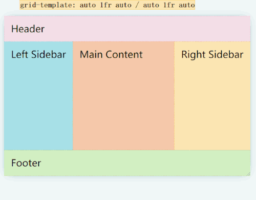
经典的圣杯布局(古典圣杯布局)
我们可以轻松地使用网格布局来实现圣杯布局,并且是弹性的。
- <div class="parent"> <header class="pink p">Header</header> <div class="left-side blue p" contenteditable>Left Sidebar</div> <main class="p coral" contenteditable> Main Content</main> <div class="right-side yellow p" contenteditable>Right Sidebar</div> <footer class="green p">Footer</footer> </div>
- .ex5 .parent { display: grid; grid-template: auto 1fr auto / auto 1fr auto; } .ex5 header { padding: 2rem; grid-column: 1 / 4; }
- .ex5 .left-side { grid-column: 1 / 2; }
- .ex5 main { grid-column: 2 / 3; }
- .ex5 .right-side { grid-column: 3 / 4; }
- .ex5 footer { grid-column: 1 / 4; }
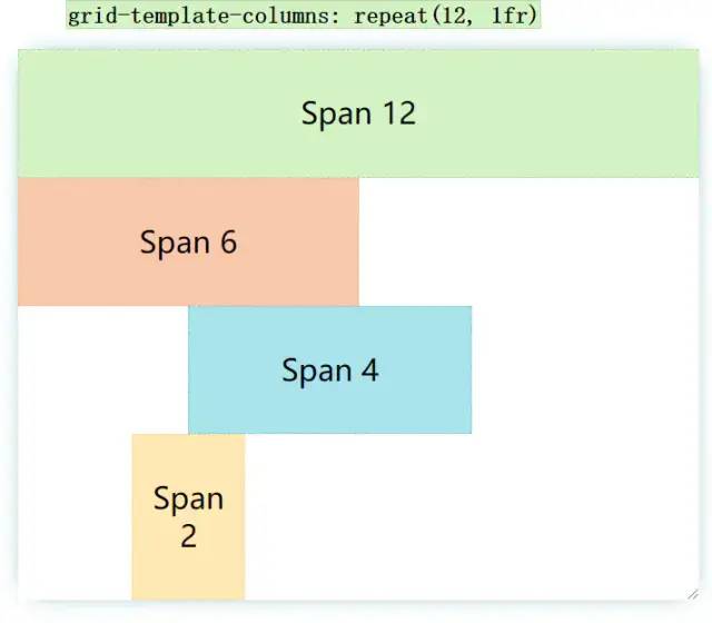
有意思的的叠块
使用 grid-template-columns 状语从句:grid-column 可以实现如下图产品所示的布局。说明进一步了 repeat 状语从句:fr 的便捷性。
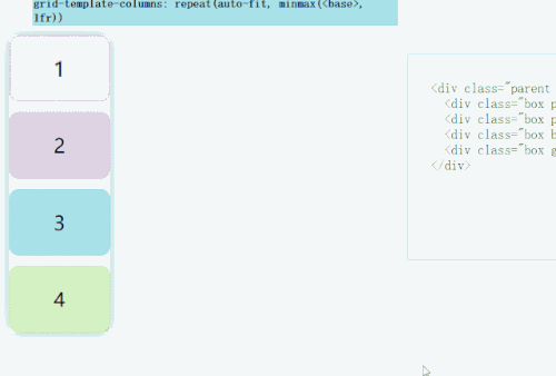
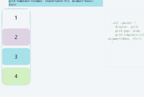
RAM 技巧
这在弹性布局图片/ box 这种非常有用(行可以排放的卡片数量自动适应)。
- .ex7 .parent { display: grid; grid-gap: 1rem; grid-template-columns: repeat(auto-fit, minmax(150px, 1fr)); }
- <div class="parent white"> <div class="box pink">1</div> <div class="box purple">2</div> <div class="box blue">3</div> <div class="box green">4</div> </div>
其效果是如果确保能够满足多个盒的最小宽度(例如上面的 150px),则自动弹性适应放置多行。
当前宽度是 160px(不考虑 gap),那么上面四个 box 的宽度会适应为 160px,并且分为 4 行
当前宽度是 310px(不考虑间隙),上面四个 box 分段两行,两个 box 平分宽度
当满足满足一行放下 3 个 box 时,第三个 box 自动到第一行
当满足满足一行放下 4 个 box 时,第四个 box 自动到第一行
我们如果将 auto-fit 对划线 auto-fill:
卡片弹性适应性
justify-content: space-between,结合 grid 和 flex 实现完的布局。
- <div class="parent white"> <div class="card yellow"> <h3>Title - Card 1</h3> <p contenteditable>Medium length description with a few more words here.</p> <div class="visual pink"></div> </div> <div class="card yellow"> <h3>Title - Card 2</h3> <p contenteditable>Long Description. Lorem ipsum dolor sit, amet consectetur adipisicing elit.</p> <div class="visual blue"></div> </div> <div class="card yellow"> <h3>Title - Card 3</h3> <p contenteditable>Short Description.</p> <div class="visual green"></div> </div> </div>
- .ex8 .parent { height: auto; display: grid; grid-gap: 1rem; grid-template-columns: repeat(3, 1fr); }
- .ex8 .visual { height: 100px; width: 100%; }
- .ex8 .card { display: flex; flex-direction: column; padding: 1rem; justify-content: space-between; }
- .ex8 h3 { margin: 0 }
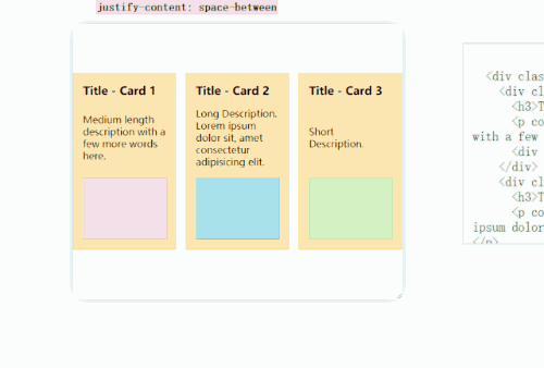
无论是宽度或高度的收缩还是延展,,都可以完子的展现卡的布局。
使用夹具实现流体印刷
最新使用的 clamp()方法可以一行实现流体排版。提高 UX,非常适合包含阅读内容的卡,因为我们不希望一行字太短或太长。
- <div class="parent white"> <div class="card purple"> <h1>Title Here</h1> <div class="visual yellow"></div> <p>Descriptive Text. Lorem ipsum dolor sit, amet consectetur adipisicing elit. Sed est error repellat veritatis.</p> </div> </div>
- .ex9 .parent { display: grid; place-items: center; }
- .ex9 .card { width: clamp(23ch, 50%, 46ch); display: flex; flex-direction: column; padding: 1rem; }
- .ex9 .visual { height: 125px; width: 100%; }
完美比例
在展现 CMS 或其他设计内容时,我们会期待图片,视频,卡片能够按照固定的比例进行布局。而最新的 aspect-ratio 可以优雅的实现该功能(使用 chrome 84+)
- <div class="parent white"> <div class="card blue"> <h1>Video Title</h1> <div class="visual green"></div> <p>Descriptive Text. This demo works in Chromium 84+.</p> </div> </div>
- .ex10 .parent { display: grid; place-items: center; }
- .ex10 .visual { aspect-ratio: 16 / 9; }
- .ex10 .card { width: 50%; display: flex; flex-direction: column; padding: 1rem; }
